
Share the detailed methods of making 20 EXCEL charts that I often use in my work. Because
has to deal with a large amount of data in its work, it often has to do PPT to report to the leaders, and sometimes it has to be reported when it is notified. All we have to do is to prepare the venue and inform the attendees. How to make the report chart well in such a short time? here is my experience.
hides
data visualization design and production work ahead of time, no matter want to know which aspect of the data, you can achieve point-and-order query, point to him to see it. For example, the following human resources data dashboard, human resources data may be involved in all the data has been designed, as long as personnel changes, increase or decrease personnel, all the data charts are automatically generated and displayed in a timely manner. For example, the total amount of human resources, the establishment of dynamic posts, and the main panel of all kinds of structures are clear at a glance; the report data are immediately statistically generated and can be viewed by clicking on the name of the report on the left; the specific situation of the fixed posts of various departments and posts, the performance of each person in each department in the current year and in the past three years can be queried immediately.
II, collect chart templates, replace the data to generate beautiful charts

, for example, I have several departments of sales share data to report, want to do a few dashboard data charts, dashboard I can not do what to do? As shown in the following figure, if we collect the chart template of the dashboard, you can change your data for 10 seconds, and you can choose any dashboard you like!
III, collection of “EXCEL Learning Micro Class” to share the 20 charts the original file

EXCEL Learning Micro Class has shared the following chart tutorials 20, not only sharing the specific production ideas and steps, but also provides the original file download, in the future will continue to release new chart tutorials and various types of visualization panel production tutorials and original files, partners in need can collect, directly replace their own data.
1 and 2 cases tell you that the EXCEL average makes the data chart more intuitive and clear!
average can visually display

average can intuitively display

2, EXCEL dynamically marked the highest and lowest values of the chart, so that you can see at a glance who has the best performance! The highest and lowest values of
are clear at a glance.

3. Your EXCEL histogram is too ugly. 5 cases teach you histogram beauty! Quick collection of
can directly see the comparison between sales performance and targets.

histogram is more beautiful.

shows the sales of flowers with sunflowers.

shows the sales of this fruit with different fruit columns.

4, Excel whirlwind chart two production methods, simple and beautiful!
whirlwind chart made by cluster bar chart

whirlwind chart made by auxiliary column and stacked bar chart

5, EXCEL double-layer pie chart, done in 5 steps, make your data more hierarchical!
beautiful micro-stereoscopic double-layer pie chart

6, different EXCEL percentage chart, make your chart different! All kinds of
containers can be used to make percentage charts

7, 4 steps to learn the EXCEL composite bar pie chart production method, to make the statistical results more intuitive!
composite pie chart makes the data clearer

8, simple 4 steps, easy to make high-end EXCEL pearl chart
multi-project with slider bead chart beautiful intuitive

9, 1 minute easy to make cool EXCEL advanced circle chart
PPT commonly used circle chart

10, EXCEL imitation mobile phone battery percentage chart, 10 frames are presented, the completion rate is clear at a glance
10 grid presentation Beautiful

11, quickly collect data visualization artifact-EXCEL conditional format dynamic percentage chart
conditional format production, with 100grid display percentage

12, EXCEL produced imitation WIFI signal percentage map, let your chart beautiful and novel creative
imitation WIFI signal percentage map, creative

13, EXCEL pulse chart, trend analysis is that simple The boss likes
‘s annual sales trend at a glance.

14, 4 steps to complete the EXCEL multi-classification circle chart (mosquito incense map), let the data comparison more intuitive
mosquito incense map, beautiful, creative

15, 4 steps to complete the EXCEL high simulation data dashboard, your data Kanban let the boss’s eyes bright
high simulation data dashboard

16, 4 steps to make Excel high-end dynamic chart The boss likes
to realize dynamic query

17, 4 steps to make Excel visual dynamic chart, boss likes
to use form control to realize dynamic query

18, 5 steps to make Excel visual dynamic one-page dashboard, business analysis data at a glance
uses PivotTable and slicer to realize dynamic query

19, 6 steps to make Excel dynamic sales daily Kanban It is clear at a glance that
uses controls and formulas to dynamically query daily situation

20, Excel sales weekly report Kanban, multi-dimensional dynamic chart display data, high-end atmospheric class
uses controls and formulas to achieve dynamic query weekly report situation

needs to share the above 20 original files, please forward the original tutorial private message to contact me.
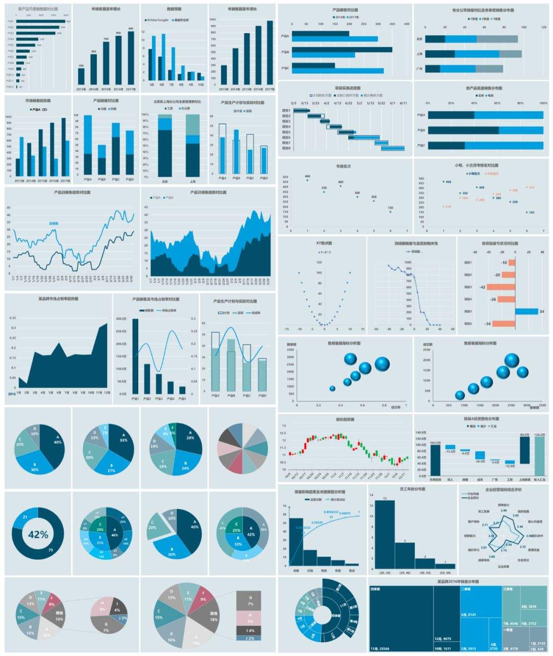
four, collection of the following 60 charts, ready to spare
1, catalogs and preview maps easy to query
in order to facilitate friends to find and choose, all charts in a workbook, and the establishment of a catalog, chart name and preview picture are put in the directory, which map directly click the name of the chart can directly open the worksheet, very convenient and fast, can be used, as long as you replace the data.
2. The chart is beautiful and you can directly use

to select a few pictures to show you the results.
选几个图让大家看看效果


