
Whether you are a researcher compiling local election data or a teacher sharing local wildlife population data with your class, there is no better alternative than a chart. These visualization tools turn boring and seemingly worthless data into information that is easy to digest.
The great thing is that you don’t have to worry about dealing with complex graphics building software, because WordPress graphs and charts can be made using simple plug-ins. So here we outline which plug-ins are the best, and we’ll show you how to create beautiful WordPress charts and graphs.
- Advantages of making charts and graphs in WordPress
- 5 valid WordPress chart and chart plug-ins
- How to create beautiful WordPress charts and graphs
Advantages of making charts and graphs in WordPress
You may wonder why you can’t simply develop a graph or chart in Excel and then take a screenshot of it to place it in your blog post. Sometimes this method works well, but sometimes it is a huge waste. The main reason to use Excel or other chart builders is when you need advanced features that the WordPress plug-in cannot provide.
Otherwise, here are the benefits of using plug-ins to make WordPress charts and graphs:
- It integrates all your graphical builds into one area. If you make graphs or charts regularly, you can save a lot of time.
- If necessary, it allows you to go back and edit the drawing. The picture limits quick repair and requires you to find the old file used to make the chart.
- Some charts and graphics are interactive, which pictures can never do.
Overall, the WordPress Chart plug-in simplifies the process, but it still provides you with most of the functionality you need for blog posts.
5 valid WordPress chart and chart plug-ins
Before we start the tutorial on how to create beautiful WordPress charts and graphics, we want to know about the best plug-ins to do what you need.
- wpDataTables
- WordPress Charts and Graphs Lite
- WordPress Charts
- Interactive Maps, Charts, Graphs
- UberChart
1. wpDataTables
WpDataTables is a very powerful WordPress plug-in! Don’t let the name deceive you. It can do more than just create typical tables. You can also design a variety of charts and graphs. It is specifically developed to allow you to enter large amounts of data and quickly convert it into beautiful graphics to be displayed to your readers.

WordPress plug-in wpdatatables
WpDataTables is an advanced plug-in with a license starting at $44. Some of its features include:
- Everything is responsive, which means they will expand perfectly for each device
- The wpDataTables plug-in has three different chart rendering engines: Google Charts, Highcharts, and Chart.js. This allows you to use many customizable options to render simple and flexible charts
- Real-time automatic refresh of tables and charts
- Preview your charts and tables at the back end
2. WordPress Charts and Graphs Lite
If you want to use beautiful charts and graphics to display data and information on your WordPress blog, then the excellent WordPress Charts and Graphs Lite plug-in is your best choice. It does an excellent job of creating beautiful interactive visual effects, while giving you the freedom to customize the output to suit your exact requirements: you can change colors, customize fonts, hide text, add text-even after the chart is published All of this. Displaying charts in your articles and pages is as simple as uploading a spreadsheet and adding a short code automatically generated by the plugin to your page.
Later, if you decide to change the type of chart from a block chart to a pie chart, simply click the edit button and switch. Yes, it’s really that simple. It is also worth mentioning that the charts and graphics it generates are suitable for all device screens of all sizes (desktops, tablets, mobile phones) because the plug-in is responsive.

WordPress Charts and Graphs Lite
It includes nine chart types, short code support, and the option to import large amounts of data using CSV. This chart plug-in is also called the Visualizer plug-in, so you may see that it is called that. There are free version and professional version. The Professional Edition costs at least $74 (a site license) and provides tools to import from other charts. Other professional features include:
- Provide users with options for editing functions
- Private chart creation
- Automatically synchronize with your online files
- Other chart types
- You can access the real-time editor
The Lite plug-in is still very powerful. Here are some charts you can make:
- Line chart
- Pie chart
- Bar chart
- Column chart
- Area map
- Geographic map
- Tables and charts
- Scale
- Candlestick chart
- Combinatorial graph
- Scatter plot
- Time chart
3. WordPress Charts
The WordPress Charts plug-in will be my third choice, and many users like its concise design, animation and colorful options. However, it should also be noted that it has not been updated for some time.

WordPress Charts plug-in
The WordPress Charts plug-in provides six unique chart and graphic templates that you can adjust and insert your own data to display on your website. The charts provided include:
- Line
- Pub
- Pie
- radar
- Polar regions
- Doughnut type
All of these charts are built using HTML5. Customization options are almost endless, but you must know something about coding, short code, or at least adjusting the default settings. The reason we like this WordPress Chart plug-in very much is that it is very lightweight. You can insert dozens of charts into all blog posts without problems. This is the whole point of using HTML5. You can eliminate clutter without sacrificing any functionality.
4. Interactive Maps, Charts, Graphs-For VC
If you currently have Visual Composer plug-ins on your website, then Interactive Maps, Charts, and Graphs-For VC plug-ins may be suitable for you. It is an add-on to Visual Composer, so there is no reason not to use it.

Interactive Maps, Charts, Graphs-For VC plug-ins
The add-on costs $12 and then provides interactive maps, charts and graphics, all packaged into the Visual Composer interface. The plug-in comes with vector icons, Google fonts, unlimited colors, and a host of other features for building and customizing charts and graphics. The plug-in has your standard charts and graphs, such as pie charts and line charts. There is also a unique mapping feature that highlights certain areas, whether it’s a local map or a world map.
5. UberChart-WordPress Chart Plugin
UberChart is a more general-purpose advanced chart plug-in because it does not require the Visual Composer plug-in. The plug-in provides 10 built-in chart types, and you will receive approximately 240 customizable options for each chart.

UberChart-WordPress Chart Plugin
You can export and import data by clicking buttons, and responsive design ensures that all your charts are displayed on each device. Some chart types include:
- Line chart
- Area map
- Bar chart
- Pie chart
- Doughnut chart
- Bubble chart
The most impressive part of this WordPress chart plug-in is the spreadsheet editor. It allows you to copy data from any program you want, such as Excel, combining the more advanced features of Excel with the versatility of chart plug-ins.
How to create beautiful WordPress charts and graphs
One of our favorite chart plug-ins is WordPress Charts and Graphs Lite. Therefore, we will only use this plug-in to complete this tutorial. Other chart plug-ins have similar tools, but different interfaces. So, I suggest testing them to see which one suits you, because wpDataTables is also very robust!
Step 1: install and activate the WordPress Charts and Graphs Lite plug-in
It’s simple.
Step 2: go to Visualizer Library and add a new chart
As we mentioned briefly above, the WordPress Charts and Graphs Lite plug-in is also known as Visualizer. It’s a little difficult to find the settings page, but all you have to do is go to the media & the gt; visualization tool library. You do not need to configure any other settings before you start using WordPress charts.

Visualizer Library
After logging in to Visualizer Library, you will see a message “No charts found”. This is no problem at all, because we haven’t made any charts yet. Therefore, you should click the add New button at the top of the page.

Add a new chart
This shows all the WordPress charts and graphs that you can make using the plug-in. For example, it has pie charts, line charts, area charts, geographic charts, and bar charts. Nine WordPress charts are available for free. If you pay for the professional version, you can get three more charts. In any case, I will choose a pie chart for this tutorial.
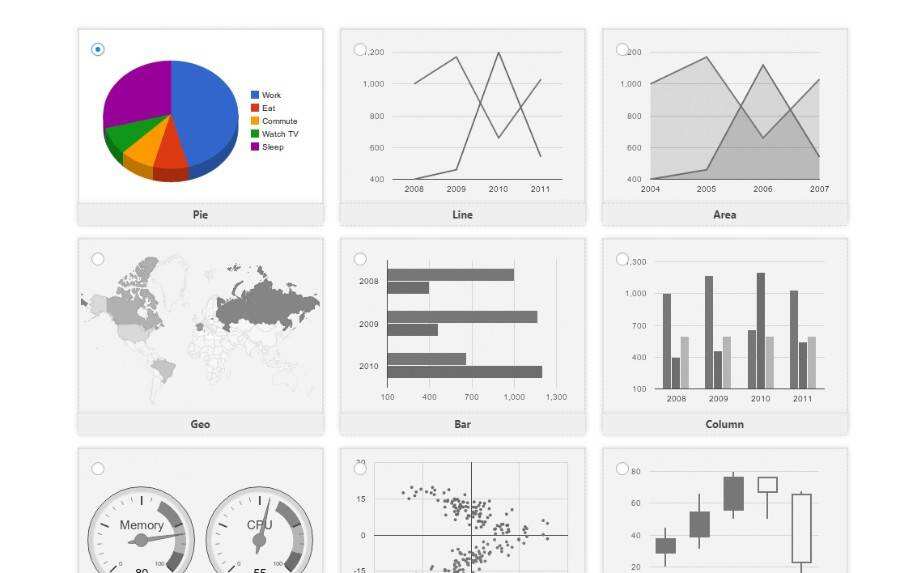
Charts and graphs
Step 3: import data into the WordPress chart
The plug-in automatically inserts data so that your chart can display something. However, in order to present your own data, you need to import it in one of five ways. You can:
- Import data from a file (probably the most common method)
- Import data from URL
- Import from another chart
- Import from WordPress (available in Professional Edition only)
- Import data manually (available in Professional Edition only)
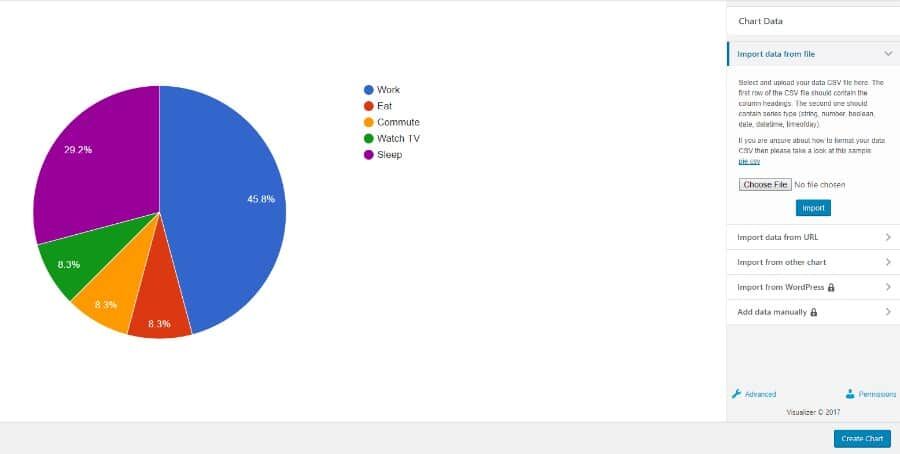
Import chart data
For this example, I import data from a CSV file. It originates from Excel files, which is one of the more common ways to import data into WordPress charts or graphs. When importing data from a file, click the Choose File button, locate the file on your computer, and then click the Import button on the WordPress dashboard.
This should show you a preview of the data on the left. The good news is that you can go back and format CSV at any time, and then try again. In the next step, there are a lot of custom tools to make things look better.
Step 4: customize your WordPress Chart
There is a small link below all import options with “Advanced” written on it. Click this button to display your custom settings. There are many options to play, so we will not introduce them one by one here.
But we can start with the title of the chart. I will type something like “Where Does Your Time Go?” Or something like that. Because my chart outlines the percentage of time people spend on certain tasks during the day. I can also change the font, font size, color, and position of the title.
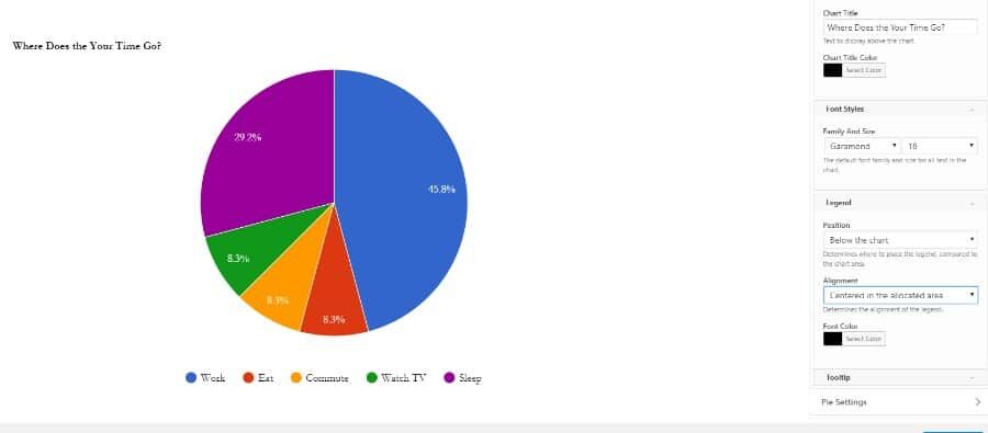
Customize WordPress Chart
As you browse the settings, you will notice several tabs for general settings, slice settings, front-end operations, and so on. You probably want to determine the location of the legend, because this is an important part of the chart.
In addition, it all depends on the type of chart you want to make and the elements you need to display. I will pretend that this is the WordPress chart of a group of my students. Therefore, I want to give them the option to print and download data and charts.
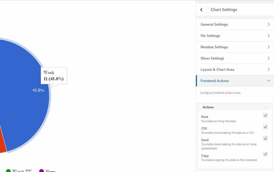
WordPress Chart Settings
To do this, go to the Frontend Actions tab. This displays a check box that allows the user to print and copy data. You can also provide them with downloadable Excel forms and CSV. When you are finished customizing the chart, be sure to save it.
Step 5: copy the short code to the page or article
After saving the WordPress chart or graph, navigate back to Visualizer Library. You will see a list of charts, which you can filter by chart type. Since I have only one chart now, I can immediately regard it as the only option. In order to publish your WordPress chart on a page or article, you must copy the short code of the chart and paste it into the desired page or article. The brief code is located below the preview of the chart (see screenshot below).

Simple code of WordPress chart
After copying the short code, create a page or article, or go to a published page. Find the location of the chart you want and paste it into a short code.
Step 6: view the WordPress chart at the front end
I suggest previewing your chart before clicking the publish button. This way you know what will happen to your users, especially because WordPress charts and graphics can be quite picky. If you look at the screenshot below, you will see a preview of my test chart at the front of the website. The print and download buttons are visible, and when you scroll, the WordPress chart has some beautiful animations, colors and title elements that look good.
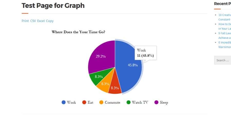
View charts / graphs
Changes occur immediately in the live preview, so you can see their impact on the chart without having to save and view the page in a new tab. There’s another feature worth mentioning, it’s great. You can edit not only the style options for the chart, but also the data in the chart by uploading another file, overwriting the original file, and replacing the old data with the new data.
Summary
All WordPress charts and graphs have different functions. The coolest part of these plug-ins is that you have all the flexibility in the world. Therefore, I encourage you to take the time to test your chart and understand the role of each setting adjustment. Then you will eventually become a chart master and people will ask you what to do. If you have any questions or ideas about how to create WordPress charts and graphics, please add a line to the comments below.

